
구조 관련 요소
기존 콘텐츠의 구조를 구분하는 시맨틱한 요소가 제공되지 않던 HTML과 다르게 HTML5에서는 main, nav, section, header, article, aside, footer등 다양한 구조 관련 요소가 추가되었습니다. 덕분에 조금더 쉽게 구조파악이 가능합니다!
| 요소 유형 | 태그명 | 설명 |
|---|---|---|
| 블록 레벨 요소 |
<header> </header> |
1. HTML 문서의 헤더 영역을 의미하는 태그입니다. 제목이나 내비게이션, 검색 등의 내용을 포함할 수 있습니다. |
| 2. 텍스트, 인라인 요소, 블록 레벨 요소를 포함할 수 있지만, <header>, <footer> 태그는 포함할 수 없습니다. | ||
| <section> </section> |
1. HTML 문서에서 맥락이 같은 요소들을 주제별로 그룹화해주는 태그입니다. 주제에 대한 제목요소(h태그)를 포함하는 것이 좋습니다. | |
| 2. 텍스트, 인라인 요소, 블록 레벨 요소를 포함할 수 있습니다. | ||
| <footer> </footer> |
1. HTML 문서의 푸터 영역을 의미하는 태그입니다. 섹션 작성자나 저작권에 대한 정보, 관련 문서 링크를 포함할 수 있습니다. | |
| 2. 텍스트, 인라인 요소, 블록 레벨 요소를 포함할 수 있지만, <header>, <footer> 태그는 포함할 수 없습니다. | ||
| <nav> </nav> |
1. HTML 문서의 메인 메뉴, 목차 등을 정의해주는 태그입니다. | |
| 2. 텍스트, 인라인 요소, 블록 레벨 요소를 포함할 수 있습니다. | ||
| <article> </article> |
1. HTML 문서 내에서 독립적으로 배포나 재사용 가능한 게시물, 뉴스 기사, 블로그 포스팅 등을 의미하는 태그입니다. 제목요소(h태그)를 포함하는것이 좋습니다. | |
| 2. 텍스트, 인라인 요소, 블록 레벨 요소를 포함할 수 있습니다. | ||
| <asdie> </asdie> |
1. 콘텐츠와 관련이 없는 영역을 의미하는 태그입니다. 오른쪽이나 왼쪽의 사이드 메뉴나 광고 영역에 사용됩니다. | |
| 2. 텍스트, 인라인 요소, 블록 레벨 요소를 포함할 수 있습니다. |
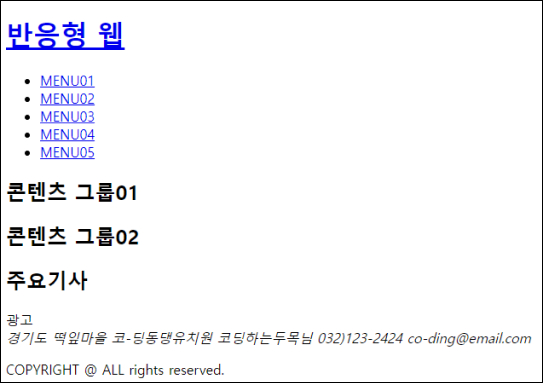
* 예시
<header>
    <h1><a href="#">반응형 웹</a></h1>
    <nav>
        <ul>
            <li><a href="#">MENU01</a></li>
            <li><a href="#">MENU02</a></li>
            <li><a href="#">MENU03</a></li>
            <li><a href="#">MENU04</a></li>
            <li><a href="#">MENU05</a></li>
        </ul>
    </nav>
</header>
<section>
    <h2>콘텐츠 그룹01</h2>
</section>
<section>
    <h2>콘텐츠 그룹02</h2>
</section>
<div>
    <article>
        <h2>주요기사</h2>
    </article>
    <aside>
        광고
    </aside>
</div>
<footer>
    <address>경기도 떡잎마을 코-딩동댕유치원 코딩하는두목님  032)123-2424    co-ding@email.com</address>
    <p>COPYRIGHT @ ALL  rights reserved.</p>
</footer>
결과보기
* 예시 활용하기
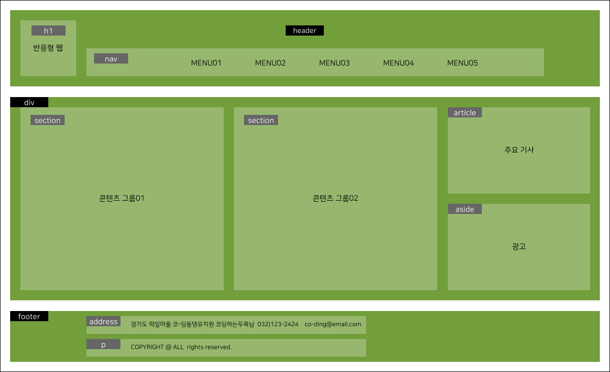
위의 html소스를 응용해서, css를 입혀서 이번엔 제법 사이트같아보이는 레이아웃구조를 만들어볼게요. 이미지와 같은 파일을 구현하기 위해 html소스가 추가되었는데요. 오늘의 주제인 '구조관련요소'를 이해하는데 방해가 되지않기 위해서 추가된 소스는 div에 class를 부여해서 코드를 작성했습니다! 사용된 소스는 아래를 참고하시고, 상세설명은 제 블로그의 [사이트만들기,레이아웃]을 참고해서 이해하시면 될 것 같네요!
소스 및 결과 보기
/* fonts  */
@import url('https://webfontworld.github.io/NanumSquare/NanumSquare.css');

/* 리셋 */
*{
    margin: 0;
    padding: 0;
    font-size: 15px;
    text-align: center;
    font-family: 'NanumSquare';
    font-weight: 400;

}

/* common */
body{
    background-color: #E1E1E1;
}
#wrap {
    width: 1160px;
    min-width: 1160px;
    margin: 20px auto;
    background-color: #f5f5f5;
}
a {
    text-decoration: none;
    color: #000;
}
a:hover {
    text-decoration: underline;
    background-color: rgb(172, 71, 71);
}
li {
    list-style: none;
    display: inline-block;
}
h1, h2, h3 {
    font-weight: normal;
}
.small_t{
    width: 67px;
    height: 20px;
    background-color: #666666;
    color: #fff;
    line-height: 20px;
}
.big_t{
    width: 75px;
    height: 20px;
    background-color: #000;
    color: #fff;
    line-height: 20px;
}
/* header */
header{
    height: 150px;
    background-color: #729E3B;
    display: flex;
    flex-wrap: wrap;
}
header .h1 {
    width: 110px;
    height: 110px;
    background-color: #96B76D;
    margin: 20px;
}
header .small_t{
    display: inline-block;
    margin: 10px 0 16px 0;
}
header .h1 a{
    display: block;
}
header .header_right{
    display: flex;
    flex-wrap: wrap;
    margin: 20px 0;
    width: 900px;
    height: 110px;

}
header .header_right span{
    width: 900px;
    height: 55px;
    margin: 0 auto;
}
header .header_right span .big_t{
    margin: 10px auto 0 auto;
}
header .header_right nav {
    width: 900px;
    height: 55px;
    line-height: 55px;
    background-color: #96B76D;
    padding-left: 80px;
    position: relative;
}
header .header_right nav .small_t{
    position: absolute;
    left: 15px;
    top: 0;
}
header .header_right nav ul li{
    width: 15%;
    justify-content: space-between;
}
/* container */
#container{
    margin-top: 20px;
    height: 400px;
    background-color: #729E3B;
    display: flex;
    flex-wrap: wrap;
}
#container section{
    width: 400px;
    height: 360px;
    background-color: #96B76D;
    position: relative;
    margin: 20px;
}
#container section:nth-child(2){
    margin-left: 0;
}
#container section .small_t {
    position: absolute;
    left: 20px;
    top: 15px;
}
#container section h2 {
    line-height: 360px;
}
#container .container_right {
    margin: 20px 20px 20px 0;
}
#container .container_right article{
    width: 280px;
    height: 170px;
    background-color: #96B76D;
    margin-bottom: 20px;
    line-height: 170px;
    position: relative;
}
#container .container_right article .small_t{
    position: absolute;
    top: 0;
    left: 0;
}
#container .container_right aside{
    width: 280px;
    height: 170px;
    background-color: #96B76D;
    margin-bottom: 20px;
    line-height: 170px;
    position: relative;
}
#container .container_right aside .small_t{
    position: absolute;
    top: 0;
    left: 0;
}
/* footer */
footer{
    height: 80px;
    padding: 10px;
    background-color: #729E3B;
    position: relative;
    margin-top: 20px;
}
footer div{
    display: flex;
    flex-wrap: wrap;
    position: relative;
}
footer .big_t{
    position: absolute;
    top: 0px;
    left: 0px;
}
footer address{
    width: 463px;
    padding-left: 87px;
    height: 35px;
    line-height: 35px;
    background-color: #96B76D;
    margin-left: 140px;
    font-size: 12px;
    text-align: left;
}
footer .small_t{
    position: absolute;
    top: 0px;
    left: 140px;
}
footer .footer_p{
    margin-top: 10px;
    width: 463px;
    padding-left: 87px;
    height: 35px;
    line-height: 35px;
    background-color: #96B76D;
    margin-left: 140px;
    font-size: 12px;
    text-align: left;
}
footer .small_t2{
    width: 67px;
    height: 20px;
    background-color: #666666;
    color: #fff;
    line-height: 20px;
    position: absolute;
    top: 10px;
    left: 140px;
}
<div id="wrap">
    <header>
        <div class="h1">
            <p class="small_t">h1</p>
            <a href="#">반응형 웹</a>
        </div>
        <div class="header_right">
            <span>
                <p class="big_t">header</p>
            </span>
            <nav>
                <p class="small_t">nav</p>
                <ul>
                    <li><a href="#">MENU01</a></li>
                    <li><a href="#">MENU02</a></li>
                    <li><a href="#">MENU03</a></li>
                    <li><a href="#">MENU04</a></li>
                    <li><a href="#">MENU05</a></li>
                </ul>
            </nav>
        </div>
    </header>
    <div id="container">
        <section>
            <p class="small_t">section</p>
            <h2>콘텐츠 그룹01</h2>
        </section>
        <section>
            <p class="small_t">section</p>
            <h2>콘텐츠 그룹02</h2>
        </section>
        <div class="container_right">
            <article>
                <p class="small_t">section</p>
                <h2>주요기사</h2>
            </article>
            <aside>
                <p class="small_t">section</p>
                광고
            </aside>
        </div>
    </div>
    <footer>
        <p class="big_t">footer</p>
        <div>
            <p class="small_t">address</p>
            <address>경기도 떡잎마을 코-딩동댕유치원 코딩하는두목님  032)123-2424    co-ding@email.com</address>
        </div>
        <div>
            <p class="small_t2">p</p>
            <p class="footer_p">COPYRIGHT @ ALL  rights reserved.</p>
        </div>
    </footer>
</div>
728x90
'HTML' 카테고리의 다른 글
| 블록/인라인 구조 (8) | 2022.08.21 |
|---|---|
| 웹 표준/접근/호환성 (8) | 2022.08.08 |


댓글